Whether you’re designing a website, an app, or you’re just looking to redecorate your house, a moodboard can help get your creative juices flowing. In fact, it could even ensure your success.
That’s why we’ve put this article together. We’ll walk you through what a moodboard is, why you need one, and how to make the most out of it. Let’s get started.
What is a moodboard?
So, what exactly is a moodboard? Simply put, it’s a collage that combines various visual elements — like colors, typography, images, and words. The goal is to gather any visual ideas that aesthetically inspire you and represent the final look you’re going for. In other words, it’s about determining the overall “mood” of your design.
Moodboards started out as physical boards covered in colorful magazine cutouts. But in an increasingly digital world, there are now plenty of tools to create your moodboard on a screen. This can be especially useful if you’re planning on collaborating or sharing your moodboard with other people.
Why you need a moodboard
Before diving into any design project, it’s important to have a clear goal. Not only can this help you approach the project with confidence, but it can also be immensely helpful for other people involved in the process. Here are some of the key benefits of using a moodboard.
Find a vision for your design
A moodboard acts as a visual representation of your ideas. This can be especially helpful if you’ve got a creative project coming up and simply aren’t sure where to start. By exploring various design resources and highlighting the elements that speak to you, you can build a moodboard that clearly defines the vision for your project.
Share your ideas with teammates
Beyond helping yourself, moodboards are also a great way to foster team collaboration. Design and aesthetics can be abstract topics, so it’s not always easy to describe these ideas in words. But by visualizing your intentions on a moodboard, it can support your ideas when you’re presenting them to teammates.
Get clients excited about a project
Similarly, a moodboard can be a great way to present design ideas to clients and keep them engaged. This can be particularly useful if they don’t have a background in design themselves. For example, if you’re designing a new office space, your moodboard can help clients imagine how they’d feel there. If you’re designing an app, you could convey how you want the user to feel. By carefully choosing images, colors, and words that fit their vision, you can use moodboards to describe your ideas and help clients visualize the project’s direction.
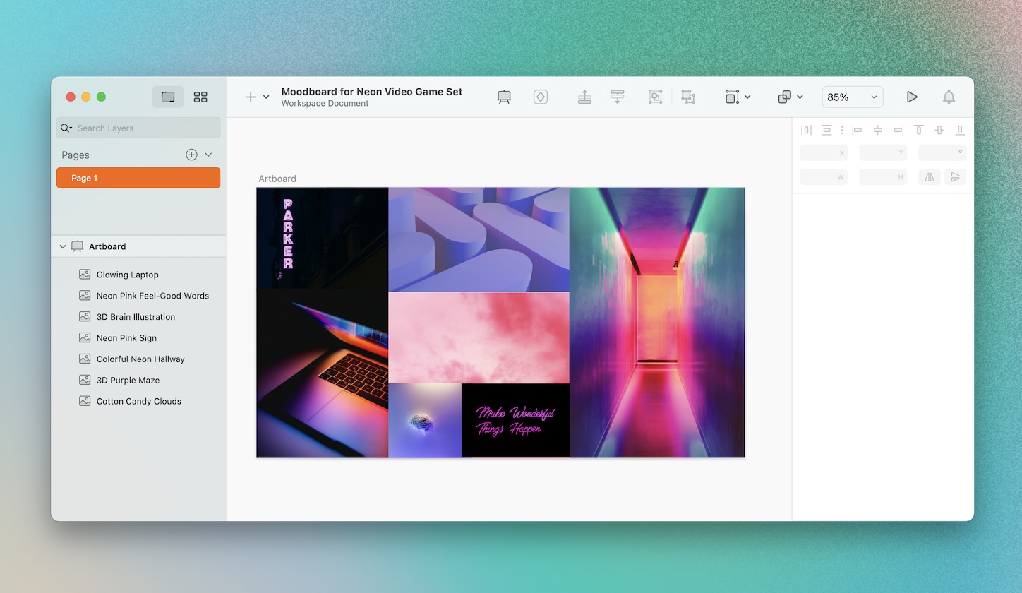
You can easily create a moodboard in Sketch by dragging and dropping images, resizing them, and repositioning them however you want.
What to add to your moodboard
Remember, moodboards are meant to inspire. So, feel free to add any visual elements that you feel represent your vision. Here are some ideas.
- Colors: Solid colors, brush strokes, or entire color palettes can help you determine a color scheme.
- Images: Add any images that express your ideas, whether it’s a photograph or a digital illustration.
- Words: You can include words or phrases that describe the mood of your project. For example, you might add the words, “plant-based” to a moodboard about a vegan cookbook design.
- Typography: Besides looking at words for their meaning, you can also consider what they look like. That could range from their font type to the overall visual presentation of the word.

Moodboards can range in size, style, and contain as many elements as you like.
Great resources for moodboards
If you’re not sure where to find visual elements for your moodboard, we’ve got you covered. Here are some handy resources you can explore.
- Stock image libraries: There are plenty of websites offering almost any stock image you might need. Unsplash, for example, provides stock images that anyone can download and use for free. And if you’re designing your moodboard in Sketch, you can save time by using our built-in Unsplash plugin.
- Blogs and social media platforms: Check out visually-focused platforms like Instagram, Tumblr, or Pinterest. And don’t worry if you’re not a regular user. Most of these platforms allow you to discover and browse through new content. By typing in the relevant search terms, you’ll likely stumble upon tons of new images, graphics, and even videos.
- Design networks: It’s also worth exploring social networking platforms made specifically for designers. Dribbble and Behance, for example, are online communities where designers can share their work with each other. Just by scrolling through these platforms, you might find illustration styles or design techniques that match your ideas.
And always remember to give credit where it’s due — no matter where you end up copying and pasting visual elements from.
Now that you know what a moodboard is, you’re ready to make one. Be sure to keep an eye out for our upcoming blog post. Next time, we’ll cover the ins and outs of how to create a moodboard.


