It’s been almost a year since we released our major redesign for Big Sur. And with a new version of macOS on the horizon, we thought it was time to take another look at some of the changes we made for the UI overhaul — this time, focusing on the toolbar icons.
As a design app, we work incredibly hard to get small details like these right — it’s in our DNA. The team took great care when redesigning the toolbar icons to make sure they offered something uniquely Sketch, while still feeling right at home on the Mac. To help us dive into the details and share some insights into what went on behind the scenes, we talked to our talented icon designer, Janik Baumgartner.
Big Sur, big updates
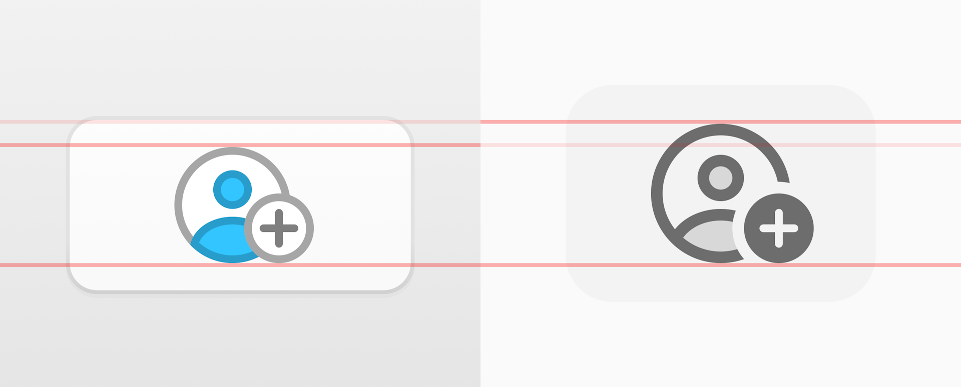
A subtle — but important – change with the new icons is their size. In Catalina, the standard size of a toolbar icon was 19 x 19px. In Big Sur (and now Monterey), it’s 24 x 24px.

Catalina’s toolbar icons, on the left, are five pixels smaller than the new icons in Big Sur and Monterey
“Normally, the bigger size would allow us to add more details to the toolbar icons, but along with the update came a slightly heavier line weight,” Janik explains. Previously, 1pt lines were the standard when it came to macOS toolbar icons — with Big Sur and Monterey the standard line weight is now 1.5pt. “Combining both these things with the other new changes added a unique challenge. It was something new,” he says.
A fresh coat of (monochromatic) paint
Icon size wasn’t the only challenge that Big Sur brought. One of the biggest changes with the new toolbar icons was the lack of color — something Sketch’s icons have had since its first release more than ten years ago. Janik stresses, “This, in particular, was a big challenge for us, because Sketch comes with a set of fairly complex toolbar icons — and a lot of them!”
“The key to designing a monochrome set of icons is to make sure you use unique, clear shapes for your icons,” he explains. Since the team could no longer rely on color, the main identifying factor would have to be the silhouette. “We tried to distinguish these silhouettes and shapes as much as possible. We also focused on grouping icons in the default toolbar set in a way that is easy to scan at a glance.”
Figuring out the new Sketch style
When it came to the style of the icons, the team obviously wanted to make sure Sketch still felt right at home on Big Sur and Monterey. “We briefly considered using Apple’s own SF Symbols, but because they’re designed to support multiple weights and sizes, their edges can sometimes appear slightly blurred,” explains Janik.
After a lot of discussions, the team decided that Apple’s Symbols weren’t right for the first Sketch release on Big Sur. Instead, they reworked every icon as a glyph. “It was important for us to highlight key details in an icon, and let other details fade into the background,” he stresses.

The icons for boolean operations proved particularly tricky to get right. After exploring a few different approaches, the team settled on the style in the middle of this image, which combined lines with filled shapes.
After trying a few different approaches, the team decided to go with a semi-filled style, which offered good legibility without straying too far from the macOS style. They created a set of line-based icons, with a fill at a lower opacity — which achieved their goals and still felt consistent with the new macOS design language. This style, which has long been a part of Sketch — since Sketch 52 to be exact — helped the team add their own design character into the mix. He added, “It worked really well for us because it let us add that extra level of detail we need for our more complex icons.”
Dark mode
Of course, with macOS supporting light and dark mode, the team’s work wasn’t done yet. They’d chosen to create a set of custom, partly-filled icons rather than using Apple’s Symbols — which use the same line-based icons for both modes. And that meant they needed to adapt them all individually, to make sure every icon was perfect.
“We had to keep in mind that the icons needed to be easy on the eyes and have good legibility in the darker UI setting,” Janik shares. “By testing out different opacity levels, we found the right balance to hit our requirements — namely, being distinctive while fitting with the dark theme.”
Designing 1.5pt icons
The increase in line point wound up being the biggest factor while designing the new icons. “Icons with 1.5pt lines can easily look very blurry on both Retina (@2x) and non-Retina (@1x) displays — if you don’t place the shapes on the pixel grid in the right way,” Janik explains. The team knew that 4K and 5K displays are more forgiving when it comes to icons that aren’t perfectly aligned with the pixel grid — but they thought it was important for the icons to look crisp on lower-density screens as well.
The answer to this issue is actually fairly simple — just make the outer edge of the shape look crisp. That meant the team had to make sure the outer line always sat on a full pixel, and the inner edge was always a half-pixel.
We know what you’re thinking — the team just used inner borders, right? Well… no. And Janik explains why.
“While using inner borders can be easier in some cases, things can quickly get confusing or inconsistent when you need an icon with an open path,” he says. “If you use outer or inner borders for only a few of your icons, you always need to double-check that you’ve calculated the correct corner radius or ‘visual’ shape size that fits with your system. We went with a center-aligned border to ensure consistency between open and closed paths.”
The key to making small icons look crisp is a sharp outline, so the team made sure every icon’s outer edge sat on a full pixel for the best possible clarity.
As you can see, when the outer edge doesn’t finish on a full pixel, the icon ends up looking blurry. In the end, Janik made the perimeter of the shape layer 0.25pt larger on each side to create a crisp outer edge on the finished icons.
Beauty in the little things
“The feedback we got as a team over the toolbar redesign has been amazing,” Janik shares. “It was a very exciting challenge and definitely a team effort. And it’s so great to have the chance to show people how much effort we put into the little things at Sketch.”
Here are just a few of the finished toolbar icons in all their glory.

We love giving you behind-the-scenes peeks at the work we do on Sketch. What would you like to see? Let us know on social and we’ll consider your ideas for our next sneak peek. For now, we hope you enjoy using the latest Mac release.


