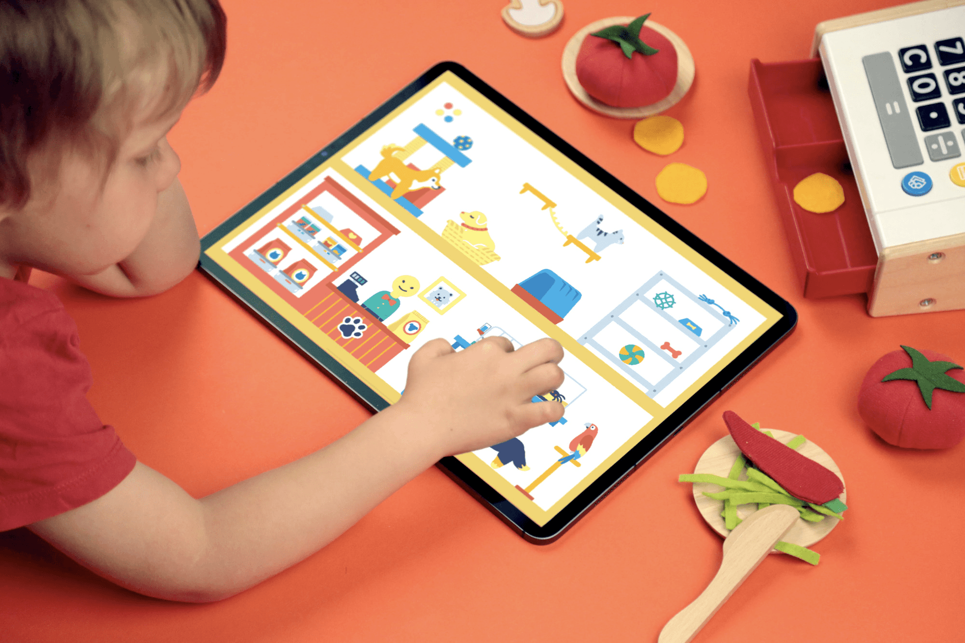
Walking through a friendly forest. Composing a song using symbols and beats with a bear DJ. These are just two activities in Pok Pok’s Playroom, a children’s toy with a unique approach. No goals, no winning — just play. Last year, Pok Pok Playroom won the Apple Design Award in the ‘Delight and Fun‘ category. What‘s more, they did so three weeks after launch.
So, how did a team of under 10 accomplish this? It took skill, hard work and tools like Sketch to make the magic of Pok Pok Playroom come to life.

The inspiration for Pok Pok Playroom came from the frustration with overstimulating, gamified apps for children.
Parents first, toymakers second
When co-founders Esther Huybreghts, now Chief Creative Officer, and Mathijs Demaeght, now VP of Design, had their second baby, the busy couple struggled to keep their toddler entertained.
”We started looking for apps, but they were all extremely gamified or very pedagogical,” explained Esther. “He was definitely not ready for the ABCs or 123s. Also, every single one of these apps was very language and UI-heavy. He would always need our help, which defeated the sole purpose of giving screen time to your kid at that age: keeping them busy for a while.”
Esther and Mathijs started designing the app they wished their son had: less gamified, open-ended and with a kid-friendly interface. They shared it early on with their remote coworkers at Snowman, the studio known for games like Alto and Skate City. Melissa and Ryan Cash were among the first to see Pok Pok and immediately knew there was huge potential. As Melissa Cash, now CEO and co-founder, puts it, “It wasn’t just, ‘let’s make a preschool app.’ It was, ‘let’s be the next Pixar of play.’”
Shortly after, Snowman became an incubator for Pok Pok — turning their vision and concept into a fully-fledged company.
Into the toy factory
After deciding to join Pok Pok, Melissa flew from Canada to Belgium, where Esther and Mathijs lived. She spent a week with the couple, laying the foundations for what would be Pok Pok. With the right team and energy coming together, they needed a first-class tech stack to support them. When it came to choosing Sketch for their design work, Melissa said it was a decision that made itself. “We didn’t even think about it!”
“We love the user-friendliness, collaborative features and how often Sketch evolves as a product.”
When it came to testing prototypes, they did so early on and with the harshest of judges: kids. To make sure children had something engaging to play-test, the team created a basic mockup of a game. Then they began refining: asking family, friends and schools to gain a deeper understanding of how to improve.

Finding the fun is our top priority, explains Esther Huybreghts (right), Chief Creative Officer.
“Designing for young children means thinking very deeply about how they think and see the world. We always focus on creating a space that they can navigate and thrive in without the support of an adult. If a child gets stuck somewhere or doesn’t know how to proceed, we’ve made a mistake,” explained Melissa.
Their audience-first approach shows in both big and small ways throughout Pok Pok. From major design choices, such as a mostly language-free UI — as many of Pok Pok’s little users aren’t reading yet — to finer points in the user experience, like including a multi-touch feature so kids can use both hands and play with as many elements as they want.
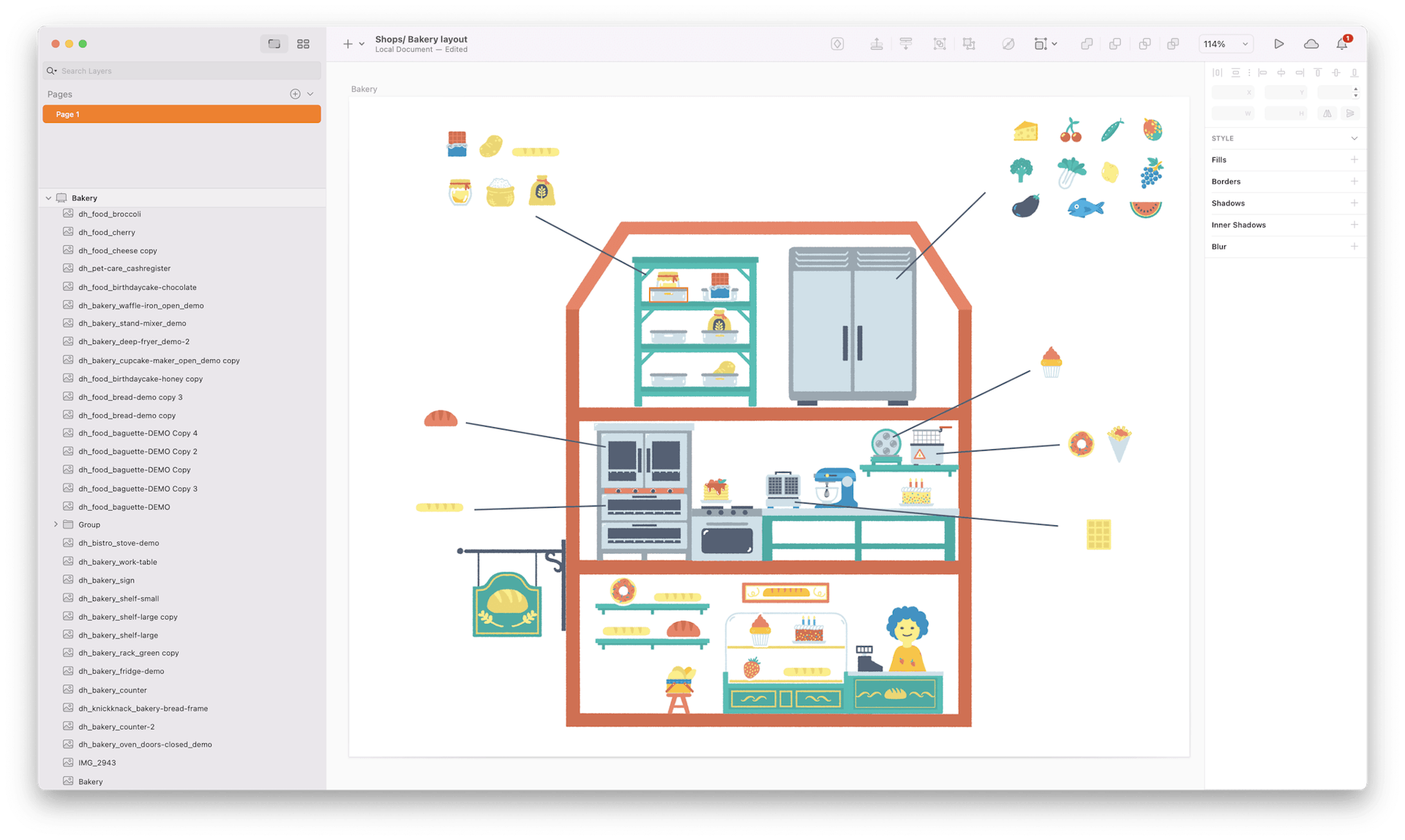
A small preview of Forest, one of the games in Pok Pok Playroom. The team uses Color Variables and Symbols to maintain their unique minimalist style, which helps children feel calm and lets them focus on exploration.
Filling up the playroom
At Pok Pok, designers, developers and sound engineers work together remotely, editing crucial details and building the prototypes they later test with kids. This is where collaborating in real-time in the Mac app comes in handy and, as Melissa says, allows seamless work across teams.

A huge portion of our design process is iteration, and Sketch’s incredible flexibility and amazing collaboration tools have enabled this process for us in many ways, said Melissa and Ryan Cash, co-founders at Pok Pok
“What’s especially valuable is that non-designers in our team can also use Sketch with ease, which we believe is a testament to its accessible design. This is really important for our workflow because it allows us to keep everything for a project in one place,” said Melissa.
The team updates the Playroom every 4-6 weeks with new toys and mini-events that mark holidays and special events. These changes are easy to make with Sketch features like Symbols and Libraries.
Across the Playroom, the team uses only 11 colors (12, including white), set as Color Variables in Sketch. The Pok Pok design style is so cohesive and well-coordinated that both Esther and Melissa say the team can look at a design or concept and instinctively know if it’s, as they describe it, ‘Pok Pok-y’.
Launching the most fun and delightful toy box — according to Apple
For both Melissa and Esther, winning their Apple Design Award was a happy surprise. “I think we do things differently. We pushed ourselves to make something unique,” Melissa says. The two were on the same page when it came to advice for building a great app: “lived experience, rather than ideas pulled from thin air,” mentions Esther. “I think a big part of what worked for us is that we created something that we built for ourselves first because we needed it. We needed something that wasn’t there.”
The coveted Apple Design Awards recognize games and apps that lead their genres in design. Pok Pok won in the Delight and Fun category only three weeks after launch.
Melissa highlighted the importance of trusting yourself when facing the challenges of building a truly memorable digital experience. “If you don’t listen to your users — whether they’re kids or adults, or fitness gurus or calendar planners, whatever your product is — no one’s going to use your product.”
Today, the Pok Pok team is well on its way to becoming the Pixar of Play. Not only are they celebrating their first anniversary but they’re doing so by welcoming new people to the team. A team that will continue to do what they do best: building new and unique digital toys that spark kids’ creativity and learning.
“We’re not going to stop creating more products with amazing tools like Sketch,” said Melissa. “I think we’re just super excited for what’s to come.”


