A look back at Sketch in 2018
It’s been another exciting 12 months for us at Sketch so we’ve taken a look back on all the new features we released in 2018.
2018 is almost over and what a year it’s been. We’ve seen the design community grow bigger and better, along with new and exciting tools being released every day. We wanted to take a moment to look back on all the new features and improvements we’ve brought to Sketch in the last 12 months, as well as some of our favorite work from other talented people in the community.
We’ve had another busy year — we shipped four major updates, including our biggest update ever in Sketch 52, and with that hundreds of new features, improvements and fixes.
2018 in numbers
This year we:
- Released 12 big new features
- Made over 130 improvements to existing features
- Squashed over 300 bugs
We’ve added a whole host of big features to Sketch since January including Prototyping, Shared Libraries on Sketch Cloud, Dark Mode, Data, a redesigned UI, all new combined shapes, Text and Layer Style Overrides, big (and meaningful) performance improvements and so much more. Here’s a roundup of our favorite updates from 2018.
Prototyping
We kicked off 2018 by releasing one of our most requested features ever. In February we announced prototyping allowing you to transform your designs into interactive prototypes and play them back in Sketch.
You can also share your prototypes on Sketch Cloud so sharing a working prototype with a developer, colleague or client is easier and more seamless than ever.
We’ve received a lot of great feedback about this feature and we’ve since added fixed elements, giving you the ability to fix the position of layers on the Artboard so they maintain their position when scrolling.
Design Systems
Last year our new Libraries feature triggered a renewed wave of interest in Design Systems across the industry, and we’ve continued to work on exciting new developments in this area.
When we released Libraries last year, we promised to make them even better in 2018. We made good on that promise this year when we brought Text and Layer Styles to Libraries, so they can now act as a single source of truth for all of your design components and not just your Symbols.
But you can only harness the full potential of Libraries if there are easy ways to share them with your team, so this year we also released Shared Libraries on Sketch Cloud.
Shared Libraries let you subscribe to Documents on Cloud, adding them directly to Sketch and allowing you to download any new or updated Symbols, Layer Styles or Text Styles, without leaving the app —perfect for using a shared design system with your team. Other designers and colleagues can share feedback and have discussions about the Library via the new and improved comments section on Sketch Cloud.
What’s more, we built support for these Cloud Libraries on open standards and we’ve been thrilled to have Apple publish their official design resources as Sketch Libraries.
We’ve just released the first public beta of Sketch 53 where Libraries and Symbols are taking another big leap forward. Set for release in January, Sketch 53 brings Symbol Overrides to the Layer List and the Canvas, making them even easier to use, and Libraries will now contain your document’s color, gradient and image presets. If that sounds exciting, keep an eye out in the new year when we’ll be able to tell you much more about Sketch 53.
UI Redesign and Dark Mode
In Sketch 52 we released one of our biggest visual updates to Sketch since 3.0 with a totally redesigned user interface. With a clean, new Layer List, a totally overhauled Inspector and brand new iconography in the toolbar and across the app, Sketch got a proper facelift, fit for the future.
There’s loads of neat little UX touches like sticky Artboard titles, improved readability of overrides, a new filtering system, a new resizing preview and more. In short, if you haven’t updated to Sketch 52 yet, you’re missing out.
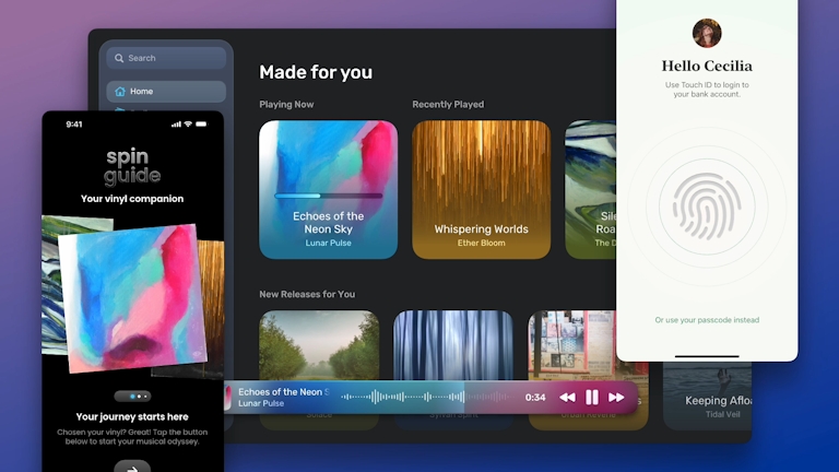
The new look Sketch also included a new feature that a lot of you were excited about — Dark Mode. Apple’s system wide dark mode on macOS Mojave paved the way for a native Dark Mode in Sketch so you can lose the distractions and focus on the thing that matters most — your work.
Designing with Data
In Sketch 52, we also introduced Data to Sketch, allowing you to populate your designs with text, images and more, in seconds. You can now add images and text from folders on your Mac or use a custom plugin to generate all kinds of data,from almost any source.
To show you the potential of Data plugins we teamed up with our friends over at Unsplash, earlier this year to create an awesome, built-in plugin that lets you add images from their stunning and expansive, royalty free image library, right inside Sketch.
We were really excited about this feature because being able to add real data to your designs, on the fly, makes rapid prototyping quicker and easier than ever, but that’s not all. By using data sources that have been created with ethnic, cultural or gender diversity in mind, Data in Sketch actually allows your designs to be more diverse and inclusive, with minimal effort.
Performance improvements
We worked hard in 2018 to make some meaningful performance improvements across the app, particularly for designers working on large or complex documents. In Sketch 50 we laid the foundations for some big changes and Sketch 51 and 52 saw some real gains when it came to speed and performance.
Sketch is now running on Metal and we implemented a brand new tiling system for the Canvas so the app performs better than ever when moving, resizing and manipulating layers in big, complicated documents. We’ve heard a lot of positive feedback from designers out there and we’re really glad we could make your experience better!
Small changes that make a big difference
Improved Boolean Operations
We made some big improvements to Boolean Operations in Sketch 52. Union, Subtract, Intersect and Difference shapes can now be nested inside each other allowing for more complex shapes to be created in a much simpler way. You can now incorporate text layers and even symbols in your boolean operations so creating really detailed icons or illustrations in Sketch is a breeze.
New Arrows
In Sketch 51 we finally got the opportunity to improve the appearance of arrows (and other markers) in Sketch. This update included seven new arrowheads and allowed improved behaviour when scaling, increasing border thickness, and changing the border ends and joins so arrows now look as good as you’d expect.
Improvements to Snapping
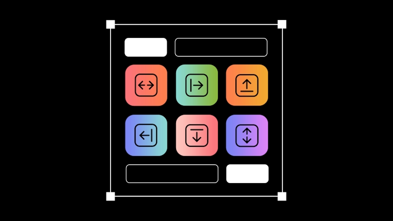
We’ve been making lots of small but important improvements to snapping throughout the year in a bid to improve your experience in Sketch and speed up your workflow.
Offset Path
We added a new Offset Path option in Layer > Path to expand or contract the outline of a selected shape. This one might seem really small but for lots of users who moved over to Sketch from other tools, we know it’s something you’ve been missing!
Innovation elsewhere
UX Power Tools
UX Power Tools is a design system UI kit for Sketch, built entirely with Styles and Symbols, letting you update the entire system in seconds instead of hours. We were blown away when the man behind UX Power Tools, Jon Moore launched a new version of his incredibly powerful design system right alongside Sketch 52, including support for new features like Text and Layer Style overrides in Sketch.
zeroheight
Zeroheight is an exciting new tool, built by a two man team, that makes it super easy to document your design system with sophisticated style guides, editable and extendable by both designers and developers. The zeroheight Sketch plugin allows you to add and sync Sketch components for truly collaborative style guides.
Versions
The team at Sympli launched Versions, which they’re calling “Git for designers”. Their version control tool offers, streamlined teamwork, a single source of truth, activity updates, a transparent history and, of course, it integrates with Sketch. Versioning for designers is fast becoming a must-have for teams, large and small, so it’s great to see new tools launching to help solve these problems.
Overflow
The brilliant team behind Proto.io released an awesome new product this year that integrates and syncs seamlessly with Sketch and lets you turn your Artboards into beautiful user flow diagrams. Overflow gives you a real overview of the user journey, allowing for better insights, earlier in the design process.
Paddy
We were sad to see work on one of our (and your) favorite plugins come to an end in October as David Williames announced he could no longer work on Paddy as compatibility with Sketch 52 became an issue. It’s always inspiring to see a plugin that really redefines what’s possible with Sketch and we’d like to thank David for all the hard work he put into it. Paddy 2 is still available for Sketch 51 and earlier.
Anima
We couldn’t mention Paddy without mentioning our friends over at Anima, who stepped in to take up the mantle after work on Paddy ended. In no time at all the talented team at Anima had shipped a new Padding feature that worked alongside their existing Stacks and Pins, and they’ve since released an update with support for padding in nested Symbols.
We really appreciate all of the hard work that talented developers are putting in to extend the power of Sketch and we can’t wait to see what this amazing community comes up with in 2019!
More to come
We’d love to hear about your favourite updates of 2018, both in Sketch and elsewhere so make sure to tweet us and let us know. While it’s always nice to look back, we’re not stopping there.
We’re already looking forward to the year ahead and there are a lot of new features and exciting updates in the works that we’ll tell you all about very soon. Keep your eyes peeled for big improvements to Overrides, an all new color popover and some exciting new features inspired by plugins like Paddy.
We hope you have a happy and peaceful holiday season and we’ll see you in the new year.